UK Business Hours: 10am - 6pm
Client Portal
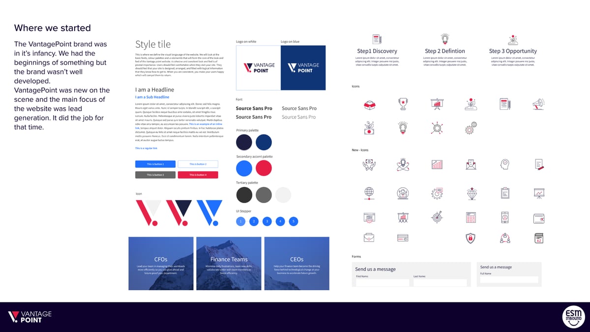
-
In this sectionServices
-
In this sectionArtificial Intelligence
-
In this sectionWebsites & Apps
-
In this sectionHubSpot
-
In this sectionContact
-
In this sectionResources
-
In this sectionGuides
-
In this sectionExperiences


.jpg "Homepage (2)")